Time For A New Sign?
We’ve put together this brief guide to help if you’re planning on purchasing some new business signage.
We’ve been printing and designing signs and graphics of all kinds for 37 years and our aim has always been to help our customers get the best possible results.
Whether it’s a flashy, attention seeking sign or a more subtle brand endorser you’re looking for, it’s definitely worth standing back and considering a few important factors very carefully before you brief your preferred sign maker…we hope that it’s us of course!
Have you carefully considered the design? What about the location? Which material will be best? How long do you want your sign to last and what about your budget?
There’s quite a lot to think about but hopefully this little sign guide will help you work through those decisions in a logical way.
Where to start?
A good place to begin when planning any new signs is with the design.
What do you want your signs to look like?
If you’re not following a pre-existing style or company branding guidelines, then the world’s your oyster…but as we all know, lots of choice can make decision making tricky!
Start by looking around you and noting what you think works well. We suggest taking a closer look at road signs. Yes really!
We take them for granted but if you are thinking about any type of new sign for your business, there’s a lot you can learn from the principles behind them…
- simple shapes
- clear typefaces and symbols
- and focusing on what the reader needs to know
If that’s spiked your curiosity and you would like to know more about British design ingenuity, visit the Design Museum’s showcase of British road signs by clicking on this link – Design Museum
It goes without saying really, that a beautifully produced new sign is not worth the effort/time/cost if it doesn’t deliver – can it be seen, can it be read quickly and is the information on the sign easy to understand?
So, for Step 1 in preparing a sign design brief, we suggest deciding on the…
Design dynamics
Look around and gather examples of signs that you like and decide what your sign needs to have on it such as a logo, wording and any images – remembering to keep it minimal.
Step 2
Size v location
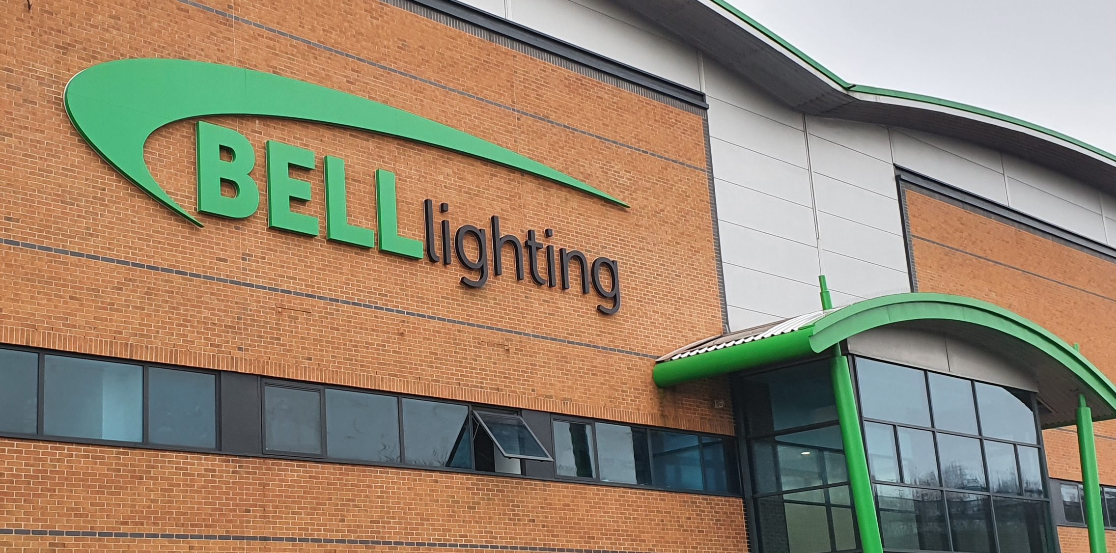
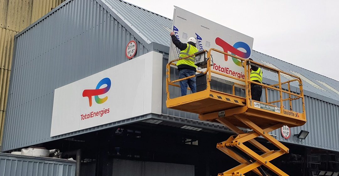
In most cases, our clients have a pretty clear idea about where they want their signs to go, and this usually has a direct link to the size.
For example signs needed to mark the entrance to a visitor centre, manufacturing site, car dealership or a new housing development will usually be big and bold and would have their own supporting structure.
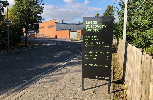
Whereas a sign that is to be fitted to a wall outside an office, doctors’ surgery or above a shop door would tend to be smaller.

When finalising your size requirements, consider where your customers will be when they view your signage. Will they be driving by and looking for your sign from the road or will they be walking past?
Getting the position and measurements spot on is really important and we suggest you ask your chosen sign provider to do them for you.
Step 3
Lasting Impressions
Now you have an idea as to the design of your sign, it’s location and size, it’s time to consider the best materials.
The material that you choose for your sign will have a huge impact on the final look and feel of your design.
There are materials that are best for exterior signs that need to withstand the weather such as dibond and acrylic and there are those that are ideal for interior signs such as foamex and correx.
Speak to your sign maker and ask for their advice, as there are lots of options and new materials coming on to the market all the time, including some really good eco-alternatives.
Here are few more details about some of the most popular sign materials:
Dibond
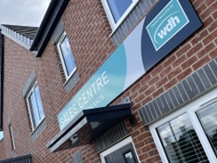
These new housing development tray signs have been made using dibond. It is an aluminium composite that is light and extremely durable. They are called tray signs because the edges are bent creating a return which is great for creating a standoff effect.
Acrylic
Acrylic is also a very durable material and can be used for exterior signage. It is very versatile and can be cut to produce a huge range of letters, symbols and logos.
Foamex
Foamex is a superior quality PVC foam sheeting that is great for printing onto. It is really smooth, easy to cut, drill and glue – all of which makes it perfect for printed signs. It is ideal for internal signage.
Correx
Correx is one of the most popular materials for printing onto. If you look around, you’ll see it pretty much everywhere…building signs, advertising boards, safety signs, estate agent boards, event signs and directional signs.
Because it is lightweight, strong, durable and low cost it is used for producing a huge range of short term promotional products, graphics and signs. This extremely versatile material is also 100% recyclable.
Permanent vs Not So Permanent
Not all signs are meant to last. Some organisations want to be able to alter the details on their signs. For example visitor attractions may want to add changes to their opening times in line with the seasons, or to publicise dates for different events.
There are a few different sign options that can give you this kind of flexibility – we’re here to help, just ask!

Or what about lower cost options that can be taken down and replaced when new promotions are needed, such as these banners and correx signs at a local Country Club.
By following these 3 steps, you will have a great brief summarising your sign needs – the design, size, location, materials and durability needed. Any sign maker would be delighted to receive a specification like this…especially us!
Please let us know if we can help with your next business sign project. Just call Gail or Stephen on freephone 0800 840 2403